New Report – "Company Summary Report"
Unlike the old reports and dashboards, the new report can:
👆 Show metric trends in both absolute values and percentages – the answer to the most important question: has it gotten better or worse?
✌️ Display comparative charts – no more manually switching to the previous period and jotting numbers down on paper.
🤟 Generate data for any chosen locations with a single click – individually or all at once.
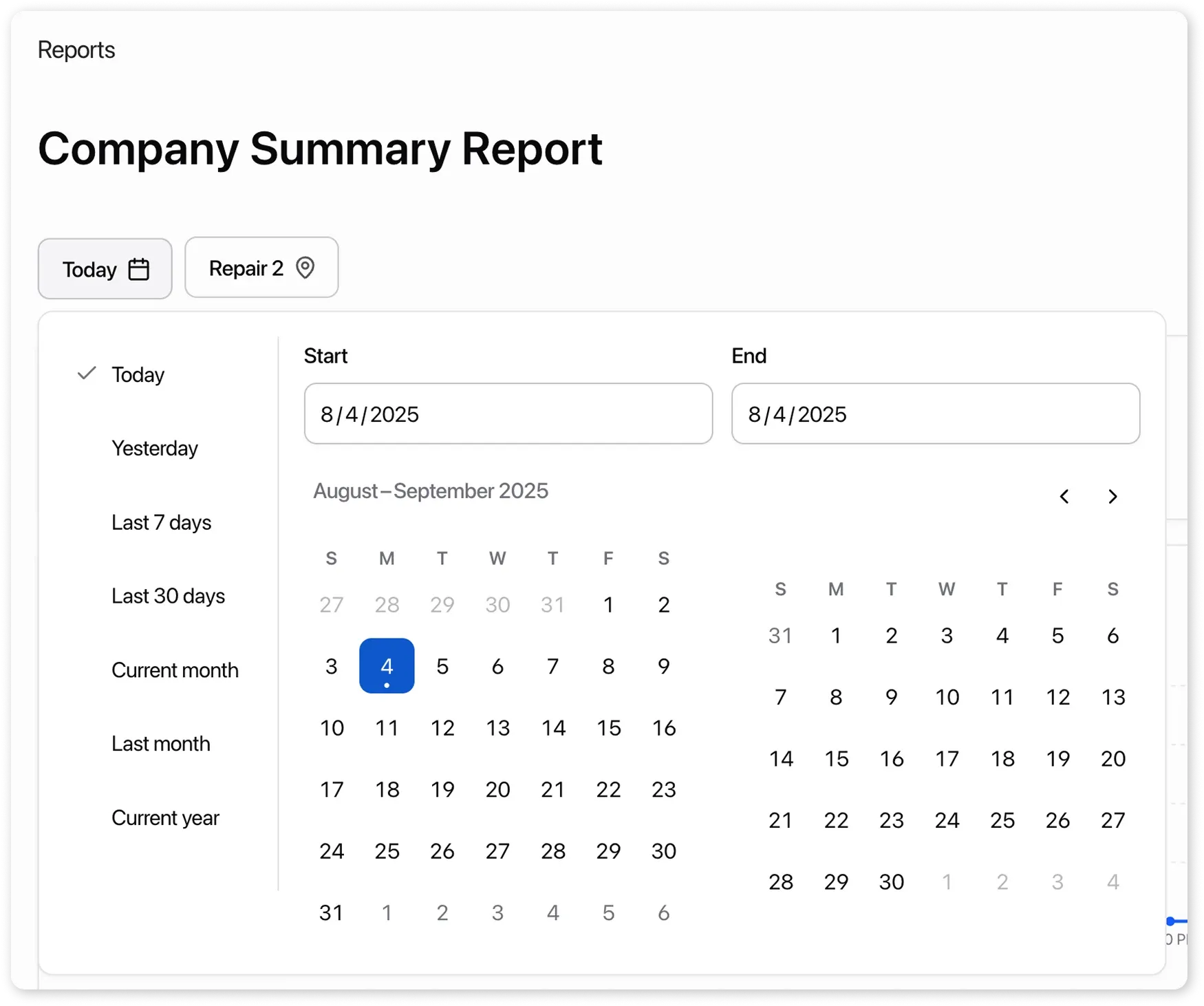
👉 Provide a convenient date selection, with options for presets or custom ranges.
This is the first in a series of planned reports, all of which will include similar functionality.
What problems does this report solve?
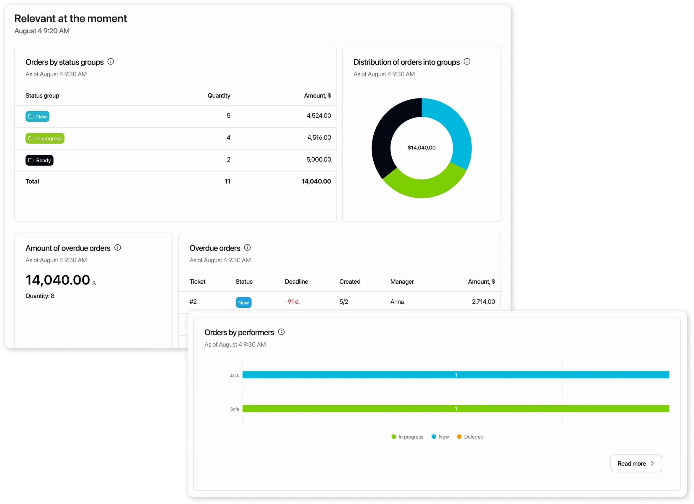
Section titled “What problems does this report solve?”The report for the company owner serves as a single point of analysis for the company’s performance. By looking at it, you will immediately understand:
- What is the company’s total revenue?
- How much money was lost due to stalled orders?
- How many orders are overdue, and for what total amount?
- Which employees are overloaded, and who could take on a few more orders
- In which months and days are there more orders, and in which fewer?
- What generates more revenue: products or services?
- How much money does the company earn from sales versus orders?
How to use it?
Section titled “How to use it?”- Select the required period
-
Review the metrics – a percentage on a green or red background indicates growth or decline of the indicator
-
Review the charts – the solid line represents the current period, the dashed line represents the previous period, making comparison easier
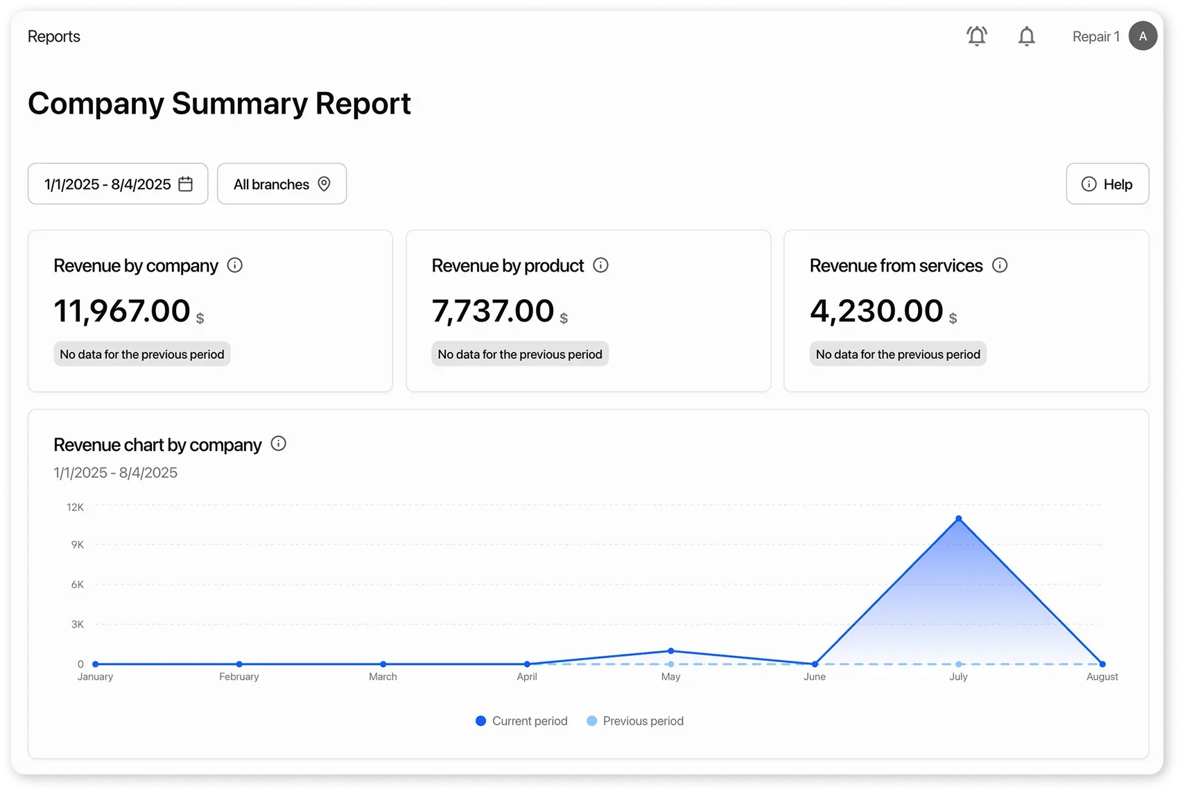
- At the very bottom, you’ll find metrics that reflect the current state of affairs, independent of the selected period